Project Description
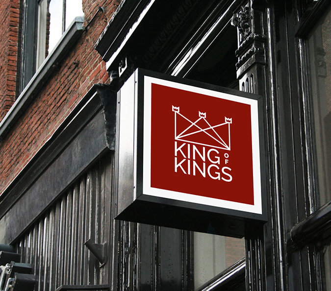
King of Kings School (Manchester) came to us recently to help them rebrand. They wanted a fresh face to take them forward; modern but not faddy, stylish but representative. We started with their logo. It was important that the school retained some of its iconography – the large, and three smaller, crowns. We reconfigured them to incorporate the schools inner-city location and ethos of industriousness – hence the girders! We love the final product, and the school are excited to implement their new designs as part of a larger roll-out.
“Beyond impressed with the service. Our initial discussion was really helpful, and it was great to have someone translate our brief into clear, creative visuals. We were listened to so well that it helped us focus our vision. I loved the choice of designs, all of which were professional, interesting and sensitive to our specific needs. We were immediately able to demonstrate our new logo to relevant people, because everything was so accessible. Our image is updated, but still reflects us. We are delighted with the results.”


